Designing a service for vulnerable users
In the UK, 12 million vulnerable people are eligible for free, specialised support from their energy supplier. But only 2 million are actually signed up.
I led a team tasked with designing a universal onboarding process to give more users access to these priority services.
The problem
Through research, we knew that many eligible people have little confidence in using online services.
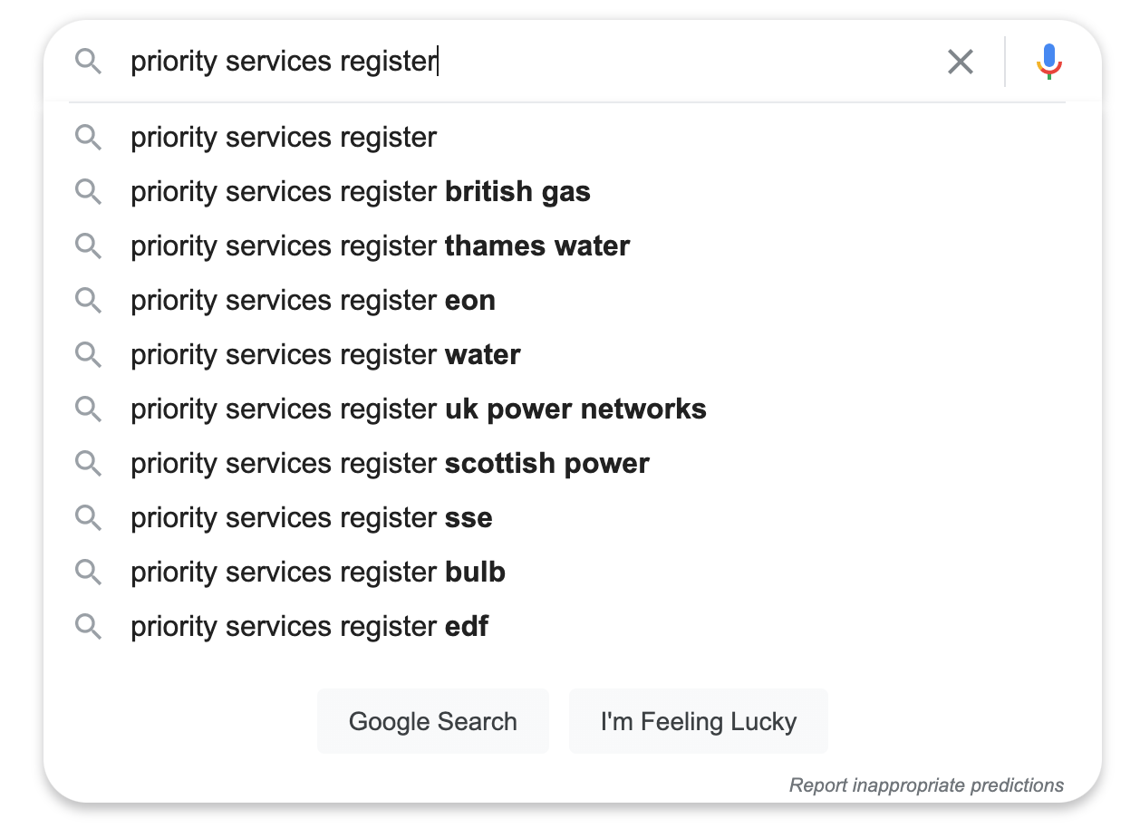
Each energy supplier has their own onboarding process. These are often long, complex forms buried deep on corporate websites.
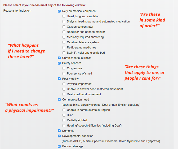
Not everyone is eligible, and a large part of the user journey involves selecting very personal criteria that qualify you.
Even if users could find the right form, they found it difficult to fill in
What we did
I worked with a user researcher and UX designer to design an accessible onboarding process that worked for our users.
Our core goals were to reduce the number of people filling in the form inaccurately, and get more people to the end of the journey.
It was clear that we needed to build trust with users through clear, concise and useful language.
Starting with user needs
Testing some of the existing journeys with users, we found that giving personal details was a key pain point.
At this point in the journey, people felt:
- mistrust
- skepticism
- reluctant to continue
We also found that around half of users selected options that didn't apply to them - or missed things that did - because they didn't understand the questions.
I set out to find the right language to support users through this difficult, intrusive journey.
People felt little confidence or trust in the process. And they had lots of questions.
Speaking our users' language
Testing showed that the list of criteria and lack of context confused and overwhelmed users.
They didn't understand why we needed data we asked for, and didn't relate to the impersonal language the forms used.
To build a more relatable journey and build trust with users I:
- arranged a group card sort to find logical categories for criteria
- talked to users about their personal needs and how they would describe them
- worked with experts to add context to some of the criteria
Find out more about how we tested microcopy with elderly users on Medium.
Before: There's no explanation why people need to give this information, and the language is dense and impersonal
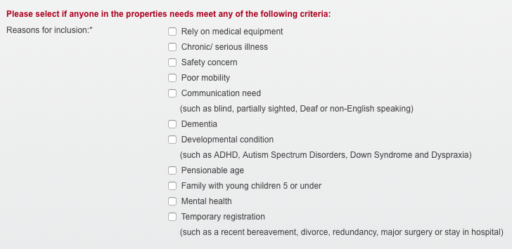
After: Reduce cognitive overhead and provide context by introducing criteria logically and progressively. Where possible, explain why users need to give data by relating to their needs.
Testing our new approach showed that using more relatable language and logical groupings saw around:
- 30% more people reaching the end of the journey
- 40% fewer people selecting things that didn't apply to them
The progressive disclosure of criteria slowed down the completion time, but increased the accuracy of results considerably.
Testing our hypotheses
But to build a complete service, we needed to record assumptions about all the people who might use it, and pain points they might have.
We attached hypotheses to make the impact on the solution clear, and defined validation signals to help guide future conversations with users.
But to turn them into user needs, we first needed to validate our hypotheses through research and testing.
Read more about how we tested hypotheses on Medium.
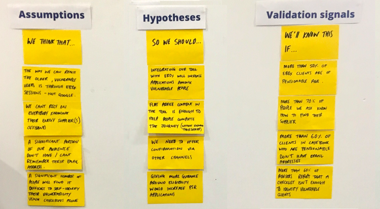
Following the Lean UX framework, user researchers, UX designers and subject matter experts all bring their own assumptions to the table
Writing for the third person
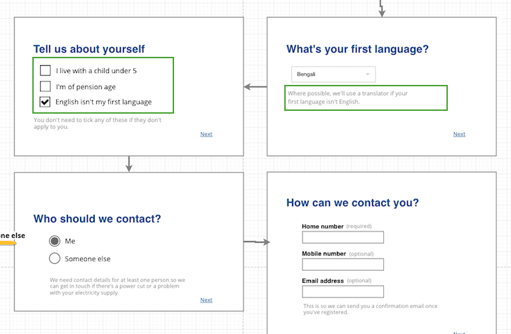
Following GDS design principles and the question protocol, I worked with a UX designer to build and test an interactive prototype of the complete service.
This showed that 'proxy users' - those filling in the form on someone else's behalf - found it difficult to identify with the language.
How we addressed the user needed to change depending on who filled in the form, and who they were filling it in for. This was the first time I'd come across a use case for third-person language.
I created a journey map to define the language for each user and their respective journey, while maintaining a consistent tone of voice.
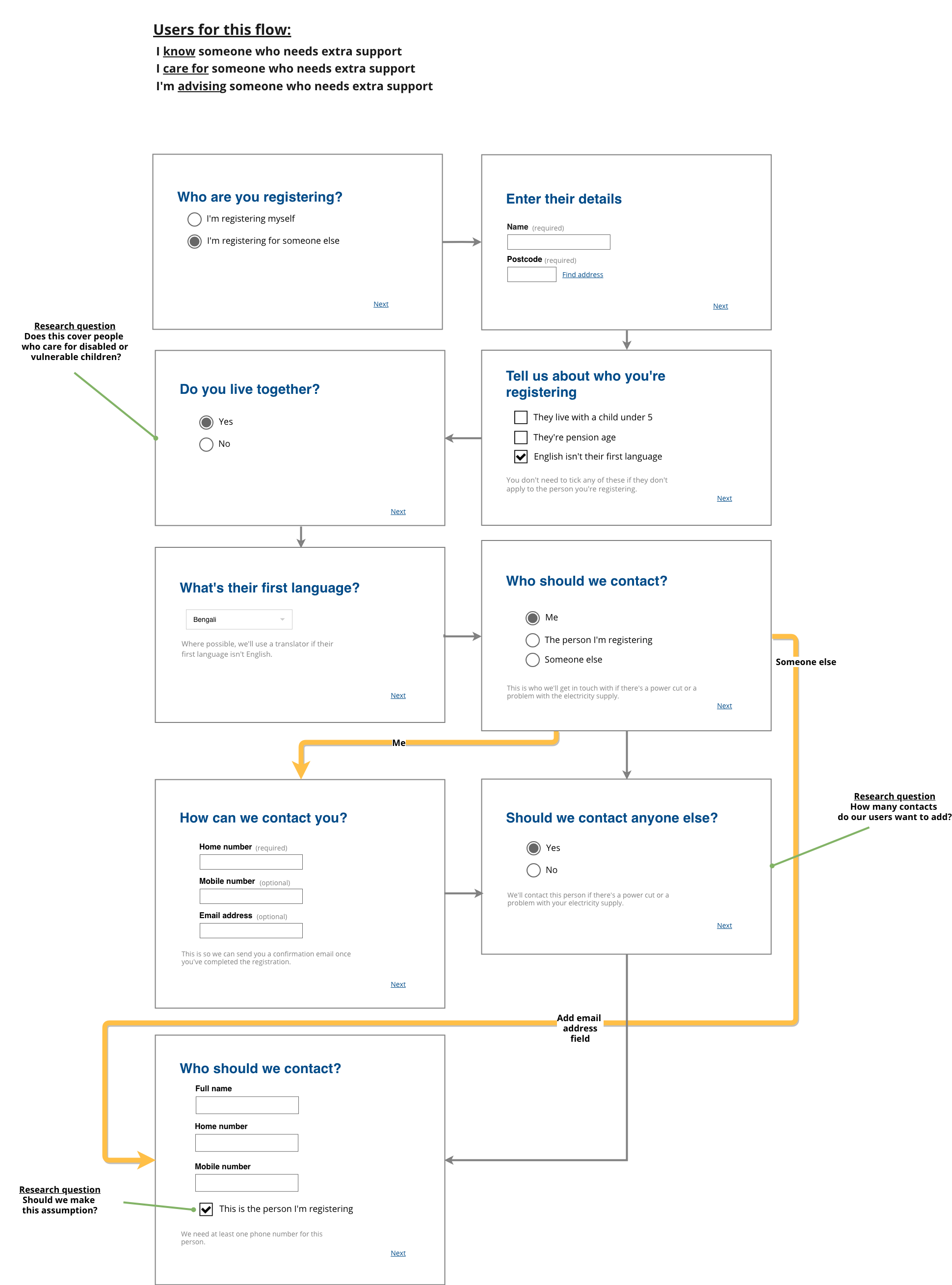
I also used this wireframe to highlight possible pain points and questions for research and testing
Quick win: building the MVP
The existing Citizens Advice content on priority services ranked highly on Google - but it was lengthy and out of date. As a quick-win, I redesigned the content on the site to:
- make the journey clearer
- distil eligibility criteria into actionable bullets
- include a simple form-finder that points users to the right form for their energy supplier
Tracking clickthrough rates on the form finder gave us an indication of how engaged users were with this content as a whole.
We used these findings to build our case for taking ownership of the full onboarding journey.